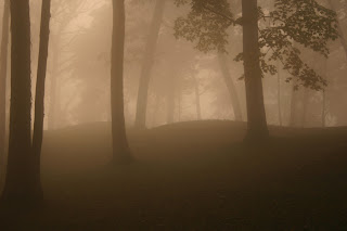
My first target audience will be Elementary-aged students who may be studying our nation's history in schools. For them I would like to create a site that has lots of photos of the mound formations to catch their interest and make them eager to learn about Native Americans. I will use these photos:
My second audience will be foreign tourists who are interested in learning about Native American culture. Again I will be relying heavily on photographs so that the user can understand what the park offers even if they cannot read English.
My last target group will be American tourists who aren't familiar with our nation's rich diversity. I will gear the site towards discovering our own country's history, learning about Native Americans and interesting educational outings to go on that are less expensive than many of today's family vacations.
The photos I have included here are ideas of what pictures I might focus on for each of the 3 audiences.
All these photos are from the National Parks website.


No comments:
Post a Comment